Note
You can download this demonstration as a Jupyter Notebook
here
Virus spread
This notebook presents an agent-based model that simulates the propagation of a disease through a network. It demonstrates how to use the agentpy package to create and visualize networks, use the interactive module, and perform different types of sensitivity analysis.
[1]:
# Model design
import agentpy as ap
import networkx as nx
import random

# Visualization
import matplotlib.pyplot as plt
import seaborn as sns
import IPython
About the model
The agents of this model are people, which can be in one of the following three conditions: susceptible to the disease (S), infected (I), or recovered (R). The agents are connected to each other through a small-world network of peers. At every time-step, infected agents can infect their peers or recover from the disease based on random chance.
Defining the model
We define a new agent type Person by creating a subclass of Agent.
This agent has two methods: setup() will be called automatically at the agent’s creation,
and being_sick() will be called by the Model.step() function.
Three tools are used within this class:
Agent.preturns the parameters of the modelAgent.neighbors()returns a list of the agents’ peers in the networkrandom.random()returns a uniform random draw between 0 and 1
[2]:
class Person(ap.Agent):

    def setup(self):
        """ Initialize a new variable at agent creation. """
        self.condition = 0  # Susceptible = 0, Infected = 1, Recovered = 2

    def being_sick(self):
        """ Spread disease to peers in the network. """
        rng = self.model.random
        for n in self.network.neighbors(self):
            if n.condition == 0 and self.p.infection_chance > rng.random():
                n.condition = 1  # Infect susceptible peer
        if self.p.recovery_chance > rng.random():
            self.condition = 2  # Recover from infection
Next, we define our model VirusModel by creating a subclass of Model.
The four methods of this class will be called automatically at different steps of the simulation,
as described in Running a simulation.
[3]:
class VirusModel(ap.Model):

    def setup(self):
        """ Initialize the agents and network of the model. """

        # Prepare a small-world network
        graph = nx.watts_strogatz_graph(
            self.p.population,
            self.p.number_of_neighbors,
            self.p.network_randomness)

        # Create agents and network
        self.agents = ap.AgentList(self, self.p.population, Person)
        self.network = self.agents.network = ap.Network(self, graph)
        self.network.add_agents(self.agents, self.network.nodes)

        # Infect a random share of the population
        I0 = int(self.p.initial_infection_share * self.p.population)
        self.agents.random(I0).condition = 1

    def update(self):
        """ Record variables after setup and each step. """

        # Record share of agents with each condition
        for i, c in enumerate(('S', 'I', 'R')):
            n_agents = len(self.agents.select(self.agents.condition == i))
            self[c] = n_agents / self.p.population
            self.record(c)

        # Stop simulation if disease is gone
        if self.I == 0:
            self.stop()

    def step(self):
        """ Define the models' events per simulation step. """

        # Call 'being_sick' for infected agents
        self.agents.select(self.agents.condition == 1).being_sick()

    def end(self):
        """ Record evaluation measures at the end of the simulation. """

        # Record final evaluation measures
        self.report('Total share infected', self.I + self.R)
        self.report('Peak share infected', max(self.log['I']))
Running a simulation
To run our model, we define a dictionary with our parameters.
We then create a new instance of our model, passing the parameters as an argument,
and use the method Model.run() to perform the simulation and return it’s output.
[4]:
parameters = {
    'population': 1000,
    'infection_chance': 0.3,
    'recovery_chance': 0.1,
    'initial_infection_share': 0.1,
    'number_of_neighbors': 2,
    'network_randomness': 0.5
}

model = VirusModel(parameters)
results = model.run()
Completed: 77 steps
Run time: 0:00:00.152576
Simulation finished
Analyzing results
The simulation returns a DataDict of recorded data with dataframes:
[5]:
results
[5]:
DataDict {
'info': Dictionary with 9 keys
'parameters':
    'constants': Dictionary with 6 keys
'variables':
    'VirusModel': DataFrame with 3 variables and 78 rows
'reporters': DataFrame with 2 variables and 1 row
}
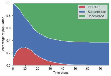
To visualize the evolution of our variables over time, we create a plot function.
[6]:
def virus_stackplot(data, ax):
    """ Stackplot of people's condition over time. """
    x = data.index.get_level_values('t')
    y = [data[var] for var in ['I', 'S', 'R']]

    sns.set()
    ax.stackplot(x, y, labels=['Infected', 'Susceptible', 'Recovered'],
                 colors = ['r', 'b', 'g'])

    ax.legend()
    ax.set_xlim(0, max(1, len(x)-1))
    ax.set_ylim(0, 1)
    ax.set_xlabel("Time steps")
    ax.set_ylabel("Percentage of population")

fig, ax = plt.subplots()
virus_stackplot(results.variables.VirusModel, ax)
Creating an animation
We can also animate the model’s dynamics as follows.
The function animation_plot() takes a model instance
and displays the previous stackplot together with a network graph.
The function animate() will call this plot
function for every time-step and return an matplotlib.animation.Animation.
[7]:
def animation_plot(m, axs):
    ax1, ax2 = axs
    ax1.set_title("Virus spread")
    ax2.set_title(f"Share infected: {m.I}")

    # Plot stackplot on first axis
    virus_stackplot(m.output.variables.VirusModel, ax1)

    # Plot network on second axis
    color_dict = {0:'b', 1:'r', 2:'g'}
    colors = [color_dict[c] for c in m.agents.condition]
    nx.draw_circular(m.network.graph, node_color=colors,
                     node_size=50, ax=ax2)

fig, axs = plt.subplots(1, 2, figsize=(8, 4)) # Prepare figure
parameters['population'] = 50 # Lower population for better visibility
animation = ap.animate(VirusModel(parameters), fig, axs, animation_plot)
Using Jupyter, we can display this animation directly in our notebook.
[8]:
IPython.display.HTML(animation.to_jshtml())
[8]:
Multi-run experiment
To explore the effect of different parameter values,
we use the classes Sample, Range, and IntRange
to create a sample of different parameter combinations.
[9]:
parameters = {
    'population': ap.IntRange(100, 1000),
    'infection_chance': ap.Range(0.1, 1.),
    'recovery_chance': ap.Range(0.1, 1.),
    'initial_infection_share': 0.1,
    'number_of_neighbors': 2,
    'network_randomness': ap.Range(0., 1.)
}

sample = ap.Sample(
    parameters,
    n=128,
    method='saltelli',
    calc_second_order=False
)
We then create an Experiment that takes a model and sample as input.
Experiment.run() runs our model repeatedly over the whole sample
with ten random iterations per parameter combination.
[10]:
exp = ap.Experiment(VirusModel, sample, iterations=10)
results = exp.run()
Scheduled runs: 7680
Completed: 7680, estimated time remaining: 0:00:00
Experiment finished
Run time: 0:04:55.800449
Optionally, we can save and load our results as follows:
[11]:
results.save()
Data saved to ap_output/VirusModel_1
[12]:
results = ap.DataDict.load('VirusModel')
Loading from directory ap_output/VirusModel_1/
Loading parameters_constants.json - Successful
Loading parameters_sample.csv - Successful
Loading parameters_log.json - Successful
Loading reporters.csv - Successful
Loading info.json - Successful
The measures in our DataDict now hold one row for each simulation run.
[13]:
results
[13]:
DataDict {
'parameters':
    'constants': Dictionary with 2 keys
    'sample': DataFrame with 4 variables and 768 rows
    'log': Dictionary with 5 keys
'reporters': DataFrame with 2 variables and 7680 rows
'info': Dictionary with 12 keys
}
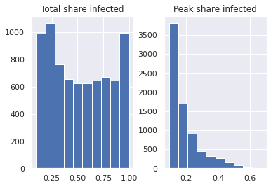
We can use standard functions of the pandas library like
pandas.DataFrame.hist() to look at summary statistics.
[14]:
results.reporters.hist();
Sensitivity analysis
The function DataDict.calc_sobol() calculates Sobol sensitivity
indices
for the passed results and parameter ranges, using the
SAlib package.
[15]:
results.calc_sobol()
[15]:
DataDict {
'parameters':
    'constants': Dictionary with 2 keys
    'sample': DataFrame with 4 variables and 768 rows
    'log': Dictionary with 5 keys
'reporters': DataFrame with 2 variables and 7680 rows
'info': Dictionary with 12 keys
'sensitivity':
    'sobol': DataFrame with 2 variables and 8 rows
    'sobol_conf': DataFrame with 2 variables and 8 rows
}
This adds a new category sensitivity to our results, which includes:
sobolreturns first-order sobol sensitivity indicessobol_confreturns confidence ranges for the above indices
We can use pandas to create a bar plot that visualizes these sensitivity indices.
[16]:
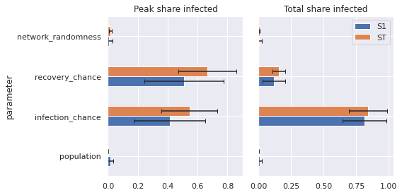
def plot_sobol(results):
    """ Bar plot of Sobol sensitivity indices. """

    sns.set()
    fig, axs = plt.subplots(1, 2, figsize=(8, 4))
    si_list = results.sensitivity.sobol.groupby(by='reporter')
    si_conf_list = results.sensitivity.sobol_conf.groupby(by='reporter')

    for (key, si), (_, err), ax in zip(si_list, si_conf_list, axs):
        si = si.droplevel('reporter')
        err = err.droplevel('reporter')
        si.plot.barh(xerr=err, title=key, ax=ax, capsize = 3)
        ax.set_xlim(0)

    axs[0].get_legend().remove()
    axs[1].set(ylabel=None, yticklabels=[])
    axs[1].tick_params(left=False)
    plt.tight_layout()

plot_sobol(results)
Alternatively, we can also display sensitivities by plotting average evaluation measures over our parameter variations.
[17]:
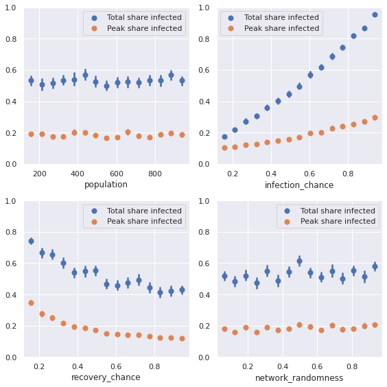
def plot_sensitivity(results):
    """ Show average simulation results for different parameter values. """

    sns.set()
    fig, axs = plt.subplots(2, 2, figsize=(8, 8))
    axs = [i for j in axs for i in j] # Flatten list

    data = results.arrange_reporters().astype('float')
    params = results.parameters.sample.keys()

    for x, ax in zip(params, axs):
        for y in results.reporters.columns:
            sns.regplot(x=x, y=y, data=data, ax=ax, ci=99,
                        x_bins=15, fit_reg=False, label=y)
        ax.set_ylim(0,1)
        ax.set_ylabel('')
        ax.legend()

    plt.tight_layout()

plot_sensitivity(results)